How Graphic Design is Closing Communication Gaps in the NHS
A look into communication cards in healthcare
Back at uni, I wrote my dissertation on graphic design in healthcare. I loved seeing how design can do more than just look good and how it can actually help people.
That’s what drew me to communication cards. These simple visual tools aren’t flashy, but they make a big difference, helping patients who don’t speak, don’t speak much English, or have disabilities that limit speech.
They help people ask for help, give consent, and feel understood.
A Long History of Visual Expression
People have always used visual ways to communicate, just look at sign language, which has been around for centuries.
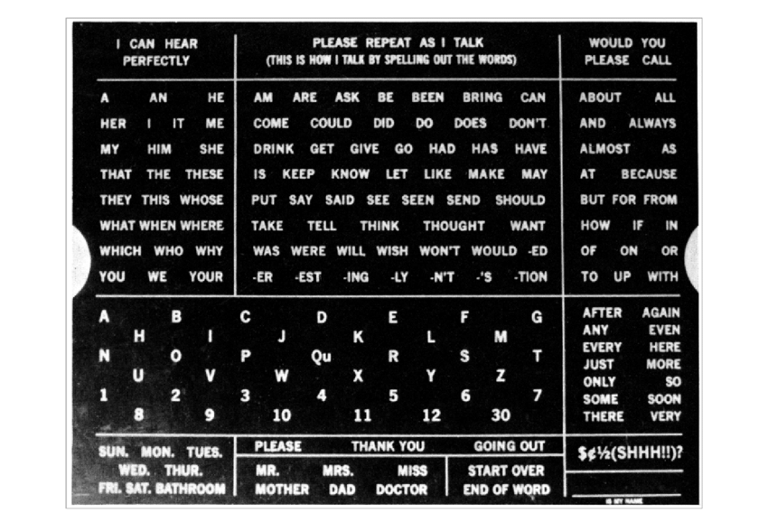
An early use of a communication card that became widely known happened in the 1920s. It was made for F. Hall Roe, a young man with cerebral palsy.
It was made of Masonite, covered in printed letters and words. It aided him in expressing himself.
It wasn’t the first visual aid ever, but it’s considered one of the first big steps in what we now call Augmentative and Alternative Communication (AAC).
When Hospitals Started Listening with Their Eyes
Fast forward 80 years, and communication cards were common in education and disability support. But there was a growing push to bring them into hospitals on a larger scale.
By 2016, the NHS had introduced the Accessible Information Standard (AIS). It legally requires all NHS services to support communication for anyone with a disability, language barrier, or additional needs.
One small but powerful example: At Barking, Havering & Redbridge University Hospitals, a young autistic boy was shown a “tummy check” card during a check-up. He nodded calmly and let the exam happen. No stress, no fear, just a moment of being understood.
The Impact of the Pandemic
COVID made communication much harder. Masks blocked lip-reading, more patients were ventilated which restricts speech, and language barriers became a bigger issue with more people needing to go to hospital.
In response, hospitals turned to more visual aids, interpreter services, and even transparent masks.
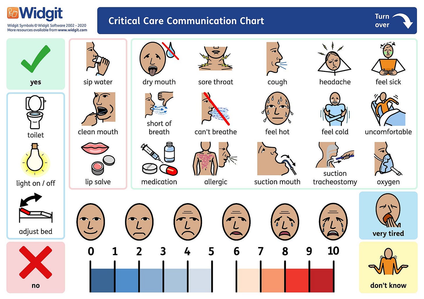
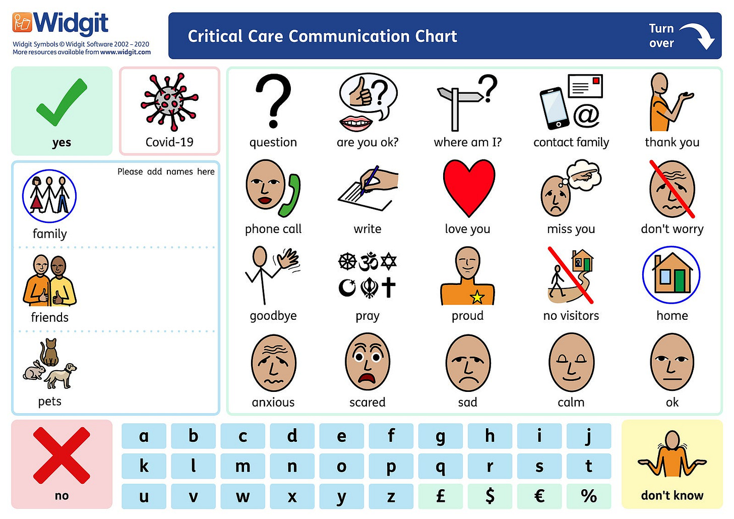
Communication boards were rolled out in ICUs, and some hospital reports show that patient satisfaction improved significantly, in one case from 20% to 40%, when visual tools were introduced.
Digital tools also took off. CardMedic, an app with flashcards in over 50 languages that became super popular.
I gave it a try myself. It didn’t have as much imagery as I expected, but since you can translate straight into almost any language (even sign language) I don’t think imagery is essential here. It already gives you access to so much information.
It also works on any device, so it’s way more accessible than using physical communication cards.
Today’s Tools: Simple, Smart, and Human
Hospitals now use a mix of low-tech and digital tools depending on the situation:
Laminated cards and boards: Quick, easy, and reusable.
Picture kits: Help with daily needs like pain, food, or care needs.
Apps like CardMedic: Translate instantly and work on any device.
Each trust might use different tools, but the goal is always the same: making sure everyone is understood.
A Designer’s Take
As a designer, I’ll be honest, some of these cards look pretty basic.
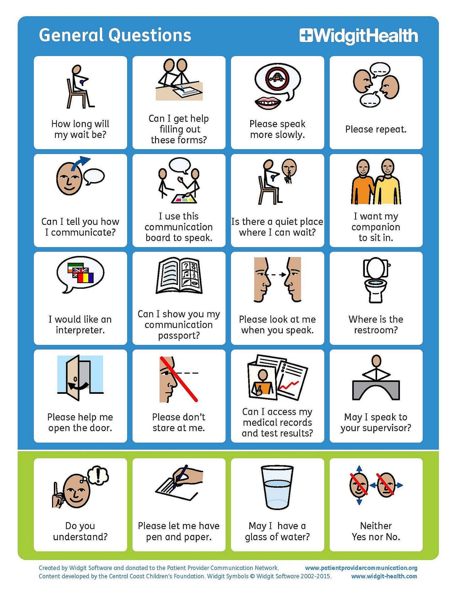
I often want to simplify and modernise them, but I get why they are the way they are. It’s not about style, it’s about clarity.
One example that stands out from other cards is Communi-cards by Poulin + Morris. Used across 150+ hospitals in the United States and Canada, they’re a simple but effective creation. They have a great balance of clean design and usability.
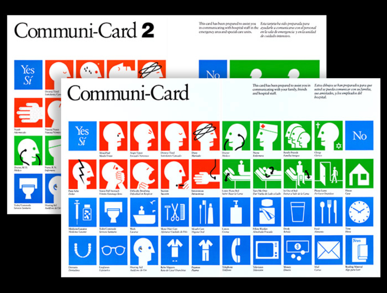
That said, different needs call for different graphic styles.
More colour and realism can help patients recognise what’s being shown. In contrast, black-and-white line art is better for patients with advanced dementia, who process simplified visuals more easily.
The key is designing for function, not flair.
There’s so much more I could have written on this topic, I could’ve easily filled a whole book! But my main aim with this article was to draw attention to the kind of design that often goes unnoticed.
What I’ve learnt is that the way we communicate has been evolving for generations, and it will continue to change as our needs do.
What matters most is this: these tools work because they put function first. At their core is something simple, a genuine desire to help.


