
Unbranding for Good: The Power of 'Ugly' Design
A case study in the power of anti-design


What happens when design is deliberately removed?
In most industries, that question would be impossible.
But in Australia in 2012, the government flipped the power of design on its head, using its absence to save lives.
Australia became the first country in the world to fully implement plain packaging laws for cigarettes. Soon after, glossy logos, bright colours, and sleek typography were replaced with minimal colour, large graphic health warnings, and tightly regulated typography.
Branding was gone. What remained was stark, unavoidable information.
Major Shift in Advertising
For decades, cigarettes were everywhere: TV, radio, billboards, magazines, movies. Smoking was sold as cool, rebellious, and glamorous in all forms of media.
When researching for this article, I came across all sorts of sneaky advertising tactics I’d never heard of, like ramping up campaigns in the first few months of the year to counter New Year’s resolutions to quit smoking (resource here, page 61).
But over time, countries around the world began banning cigarette ads. One by one, traditional channels were closed off. No more commercials. No more glossy magazine spreads. No more brand sponsorships.
As those restrictions grew, tobacco companies leaned harder on what they still had: the pack itself.
Packaging became their most consistent and visible marketing space, a miniature billboard on every shelf, designed to grab attention.
But the Australian government stepped in and even that form of branding was stripped away.
The Details of the Law
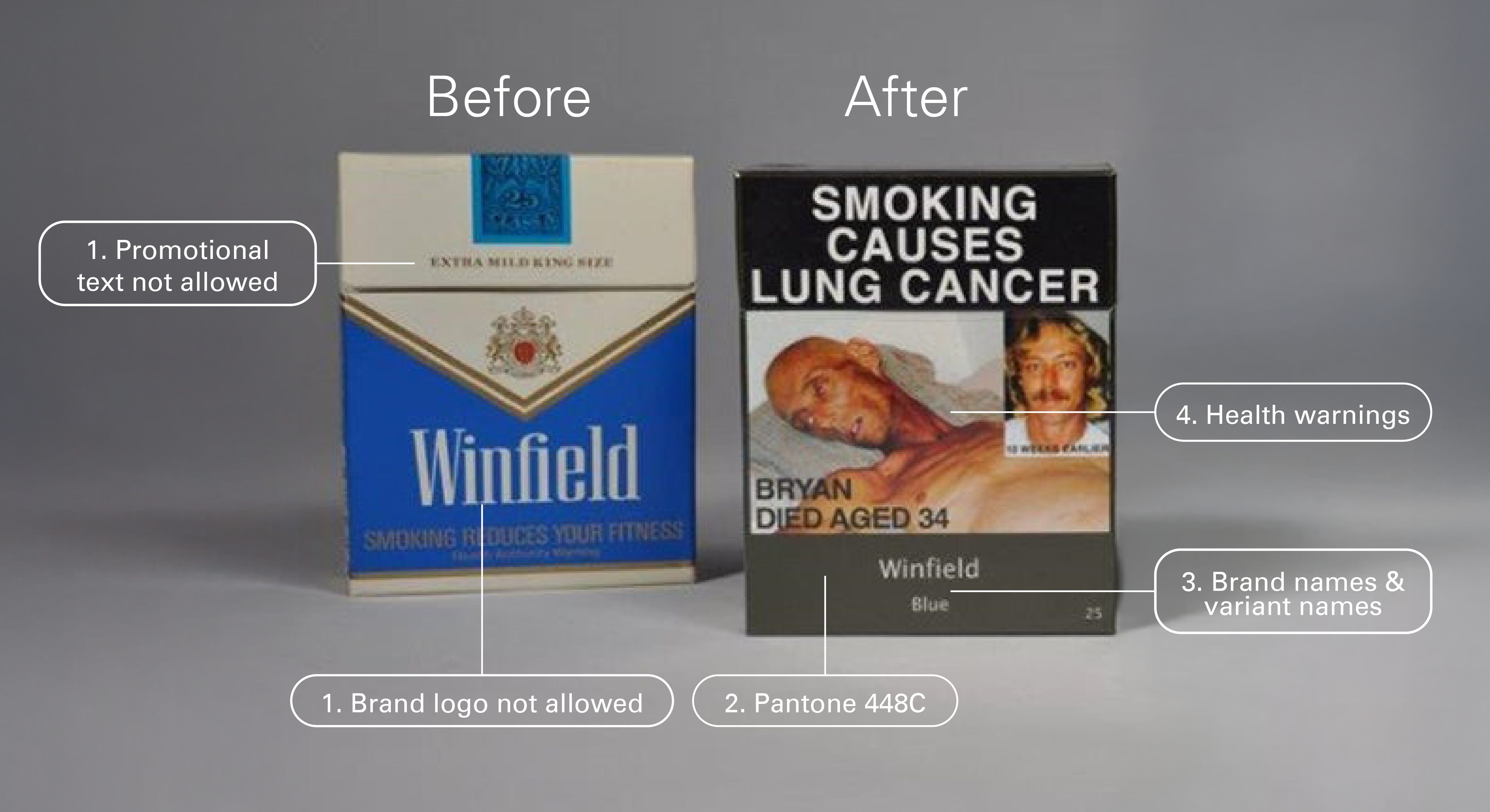
As you can see in the image below, Cigarette packaging underwent a complete transformation.
So here’s what the tobacco product and packaging requirements require:
No promotional words, brand images, or logos (annotation 1 in the above image): Promotional words like “light,” “smooth,” or “fine blend” are not allowed. No imagery or branding, only the product and brand name, shown in a specific font, size, and position.
Use Pantone 448C (annotation 2): Market research with over 1,000 smokers identified Pantone 448C as the most unappealing colour. It was associated with ‘tar’, ‘dirty’ and even ‘death’.
Display brand and variant names in certain ways (annotation 3): Brand names must appear in plain, uppercase, sans-serif type, always the same size and placement.
Display the required text and health warnings (annotation 4): 75% of the front and 90% of the back must show health warnings.
Include (if required) a health promotion insert: Some packs include leaflets promoting the benefits of quitting and offering resources to help.
The Impact
A 2016 study found that between 2012 and 2015, Australia had around 108,000 fewer smokers than expected. That’s a pretty big impact.
More studies found:
Young people felt less brand loyalty and found packs less appealing.
Smokers said the new packaging increased thoughts about quitting.
Health warnings stood out more and were harder to ignore.
The psychology here is simple: take away all the slick branding, and cigarettes lose a lot of their emotional pull. What’s left is just the reality.
The Pushback
Of course, not everyone was thrilled.
Some worried that taking branding away would lead to more counterfeit cigarettes. The government responded by tightening up border controls and penalties for illegal tobacco. Also, plain packs still have security features like tax stamps and regulated fonts, so they’re not actually that easy to copy.
Another concern was about quality. People feared that without fancy branding, smokers might unknowingly buy “worse” cigarettes. But in Australia, all legal cigarettes are made under the same standards, they’re all bad for you. There’s no “healthier” brand. In fact, part of the point was to break that illusion.
Tobacco companies obviously fought back. Some even sued the Australian government in both local and international courts. But they lost. And that gave other countries the confidence to roll out similar laws.
From everything I’ve seen, this law did a lot of good. It made smoking way less appealing, especially to new or younger smokers.
That said, this is still a complicated story. There’s been a lot of ripple effect from this design change. It’s hard to explain the full picture of the law’s impact without this article being much, much longer, but from what I can tell, overall the law has created a lot of positive change.
Lessons for Designers
This law is a powerful reminder that visual design is never neutral, there is power in anti designing. Typography, colour and layout build desire or dismissal.
Designers are often taught to sell, but the Australian model shows that design can also intervene, disrupt, and inform.
This was a really interesting read. I hadn’t considered how 'ugly' design could have such an impact before.
Such a fantastic highlight! Also, great verbiage in the title, calling it 'ugly' rather than 'bad' design. As really the design was technically good in that it achieved the result it was aiming for.